It has been a year since I posted and it’s time to get back at it! Fast-forwarding past the rest of producing the Great Wall of China to my most recent project, I’ll backpedal next time and finish the story about The Great Wall.
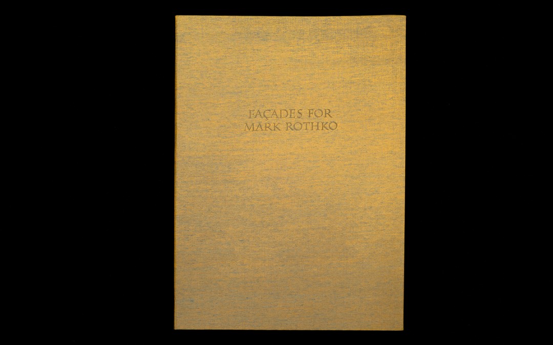
Just in time for the Oxford Fine Press Book Fair in March, my latest book project was finished. It is the last of three books I started working on at the beginning of 2016.
From the first time I heard Crispin Elsted read Façades for Mark Rothko I wanted to spend more time with the poem. It had not been published, but Crispin was kind enough to send a copy by mail. After reading it and musing on it, I asked if I could print it. When he said yes, I panicked, wondering what had possessed me to ask –how I could possibly do the poem justice?
Several years have passed since that moment of horror, and Crispin has kindly offered suggestions and provided encouragement along the way. The text was sent off to Michael and Winifred Bixler to be set in 14 point Van Dijck and the Zerkall paper was ordered from the UK. I sent two other texts off to Bixlers’ at the same time, and since they were in line to be printed first I had time to consider the poem and how to present it.
Thinking of Rothko’s paintings, I wanted the book to have a quiet presence but not be imposing, to contain and present Crispin’s writing without being illustrative. Many ideas came to mind, but they all seemed too imitative or predictable. I thought of Paul Klee’s rhythmic ‘Harmony’ paintings, and kept rereading the poems and looking at Rothko’s work. One day I had a ‘eureka’ moment when I remembered a box of maple blocks left over from a project years ago, and I asked a friend if he could cut them to type-high.
A grid of 12 squares fit on a page, and I sanded 24 blocks to varying degrees, leaving some saw marks, grain, and scratches for texture. Then I mixed ink and proofed and rearranged them until I was happy. The grid is reminiscent of a brick wall in need of mortar, light coming through the cracks and dissolving some of the bricks’ edges. To me, the images suggest façades
as well as the quiet internal light of Rothko’s paintings.
I chose colors from the poem and the paintings that inspired it, and I limited the palette, repeating colors with different configurations of blocks to create an enclosure and add something more than mere decoration.
The book cloth on the cover changes color between blue and yellow, depending on the light, and the boards are thin and flexible. It was important to me to keep an overall lightness — it is a slender volume, and we are diurnal beings who need light to see, physically and metaphorically. The poem is densely layered and the text creates a connection between the Rothko paintings and Crispin’s experience in the outside world, a stile between fields as he says in his notes. With this book, I have attempted to create a similar transit to bring the poem and reader together.
An added dimension to the book is a recording of Crispin reading this and other poems in his beautiful baritone voice, which comes as a digital download with purchase of the book.


 FLATROCK, NEWFOUNDLAND, CANADA
Painter and Book Artist